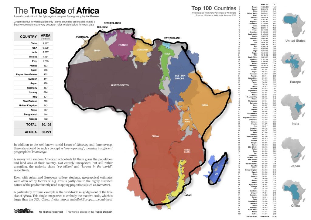
Africa is much bigger than it looks on most maps.
This infographic, produced by computer graphic enthusiast Kai Krause, confronts our geographical knowledge based on what we think the typical size of some of the world’s biggest countries.
Now add the populations for each of these countries combined. Based on this, over half of the world’s population could fit onto Africa – that’s over 3.5 billion people!

