Created by Information is Beautiful, this datapack was updated on 16th March 2020 (download). Created by David McCandless, Dr Stephanie Starling, Omid Kashan
Graphics: Information is Beautiful
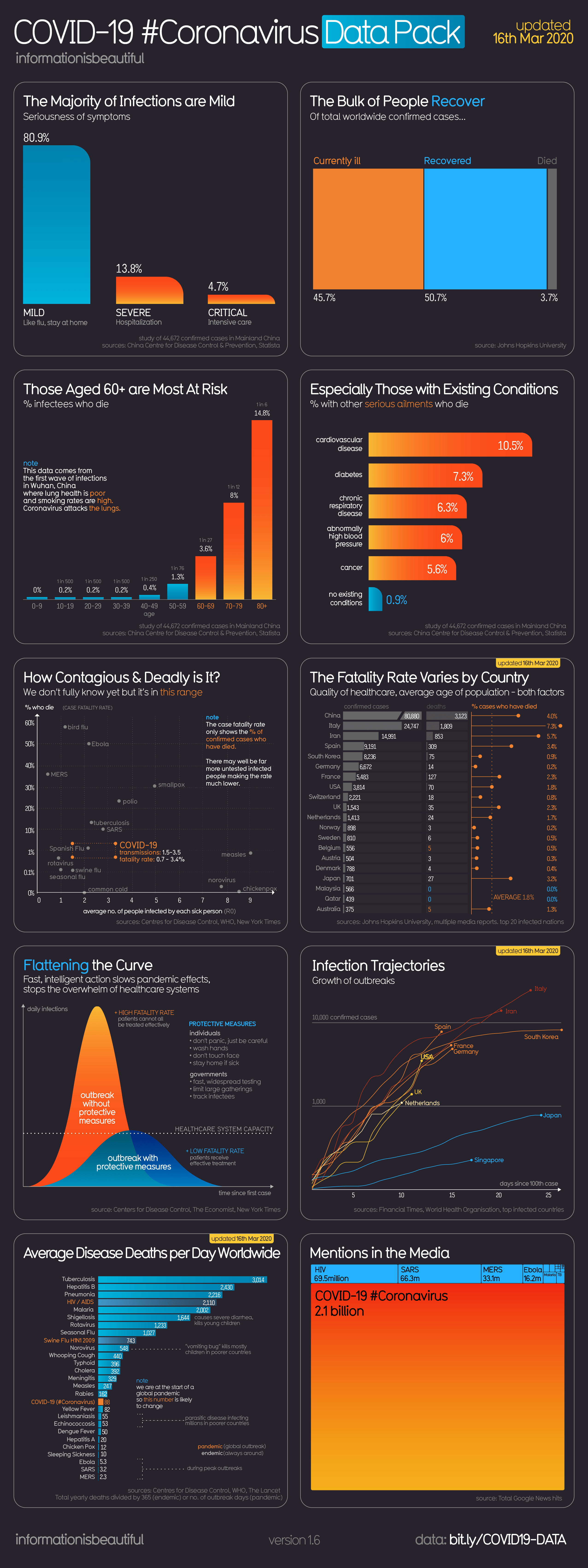
Data: various; see the latest data the graphics are generated from (Johns Hopkins University, Centers for Disease Control, World Health Organization, Statista, China Center for Disease Control & Prevention, Google News, New York Times, The Guardian)
Important Reads
- Flattening the Curve (NY Times) and interactive (Washington Post)
- World Health Organisation dashboard
- All the data in detail (Our World in Data)
- How does Corona virus compare with flu? (NY Times)
- Coronavirus is very different to Spanish flu (NY Times)
Change log
UPDATE 16th Mar
- Updated: Recovery rates, Fatality Rate by Country, Media Mentions
- Added: Average Disease Deaths per day explanation of our maths, plus Swine Flu : estimates (753 death per day), highlighted pandemic vs endemic diseases.
- New Chart: Infection Trajectories
- Corrected: Spanish Flu fatality rate 2.5% (was 10%)
UPDATE 13th Mar
- Fatality Rates by Country. Italy up to 6.7%.
- Total Media Mentions. Coronavirus now 2.1bn, up from 1.1bn.
- Average deaths per day: 72, up from 62.
- Corrected Spanish Flu Fatality Rate to 2.5%
- Recovery Rates
UPDATE 12th Mar – added Flattening the Curve. Uploaded version 2
UPDATE 11th Mar – revised Case Fatality Rates by Country. Italy up to 6.2%. Updated Recovery rates: 56.6% recovered drops to 55%. Updated Deaths Per Day: Coronavirus up 62 per day, from 56. Fixed a few typos.
UPDATE 9th Mar – Uploaded version 1