Are you prone to ‘immappancy?
Do you get easily confused by the actual size of countries and how they relate to each other by how much space they take up?
Take a look at this:
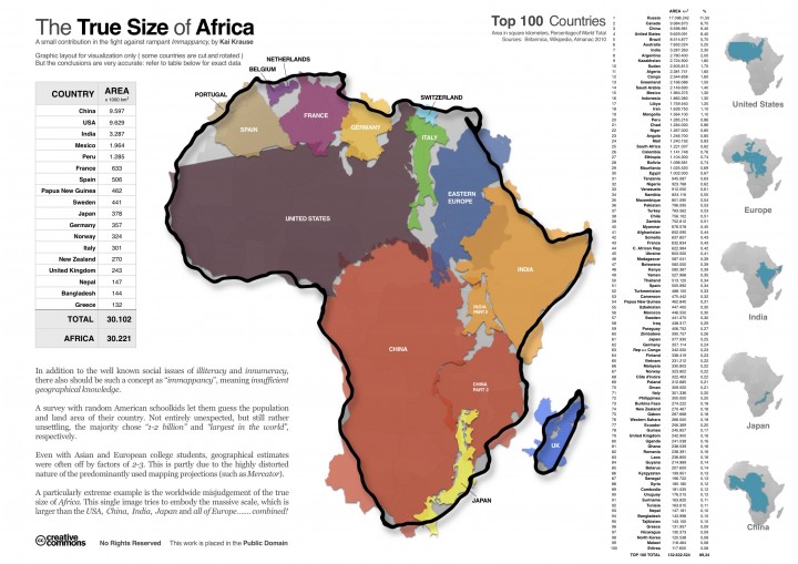
 If you’ve come across the concepts of illiteracy and innumeracy, then computer graphic enthusiast Kai Krause, who developed the innovative infographic The True Size of Africa, feels the term immappancy should be used to describe those with ‘insufficient geographical knowledge.’
It would be an interesting observation to survey students in a geography class and let them have a guess at the population and land area of their country and then the world’s continents. A random survey among students in the US, found that the majority of students were often off by factors of 2-3 choosing “1-2 billion” and ‘largest in the world’, as representing their country. These findings were attributed to the distortions represented in mapping projections such as Mercator.
Challenging the Mercator projection in particular, which distorts the relative sizes of countries and continents – for example Africa under this projection appears the same size as Greenland despite it being 14 times bigger in reality; and responding to what he calls ‘rampant Immappancy’, Krause developed the infographic ‘The True Size of Africa’, using outlines of the USA, China, India, Japan and most of Europe represented within the outline of the continent of Africa, to prove this point.
An article in the Economist, a reworking of Krause’s map using Gall’s Stereographic Cylindrical Projection, which revealed results ‘distinct from Mr Krause’s map. But however you look at it, his point is a good one: Africa is much bigger than it looks on most maps.’
_____________________________
For more…
- Right click on map and click ‘Open link in newtab/window’ to view large version of it in a stand alone window
- For a quick guide to understanding these terms follow the Wikipedia entries Mercator Projection, Map Projection and Gall-Peters Projection
