Are countries that emit the most carbon dioxide in the world also experiencing more vulnerability when it comes to climate change and extreme climate shock events such as floods, storms and drought?
A lot has been said and written about fossil fuels use and how we rely on them for heat, energy, transport and in the production of goods such as clothes, phones and plastics. As the Earth Overshoot Day team at the Global Footprint Network have noted, when it comes to food, fossil fuels are found everywhere along the supply chain:
“The fossil fuels required to grow, harvest, process, and distribute food makes up a significant part of the food Footprint. Although it wasn’t always the case, today we are firmly in the age of fossil fuel.” – Earth Overshoot Day, the Global Footprint Network
Another example: when it comes to energy use around 84% of the world’s energy consumption needs are met from fossil fuels, with oil accounting for 33% of the consumption in 2019 and natural gas at 24% and coal accounting for 27%, according to the Statistical Review of World Energy 2020 by energy company BP.
This ‘slider map’ invites readers to explore relationships in our food system and what can drive or deny access to healthy nutritious food based on the activities, roles and impact of countries in the world today.
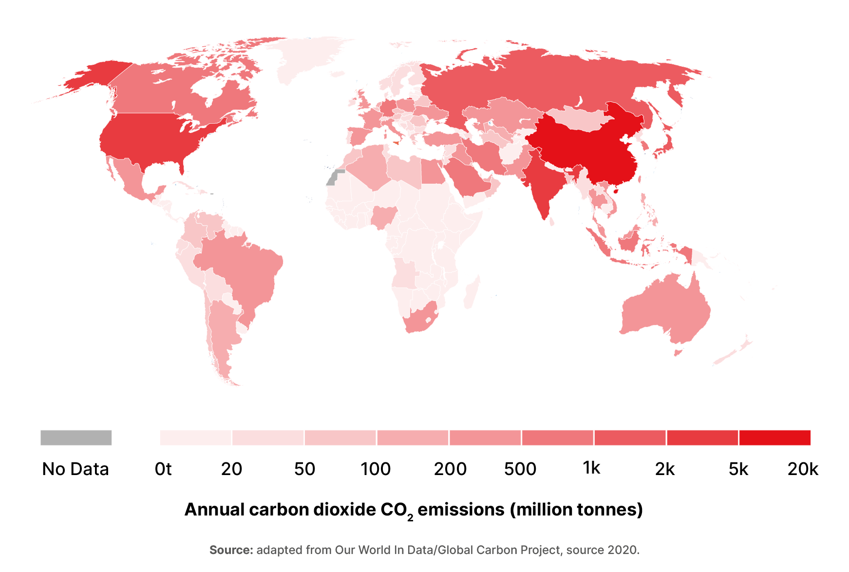
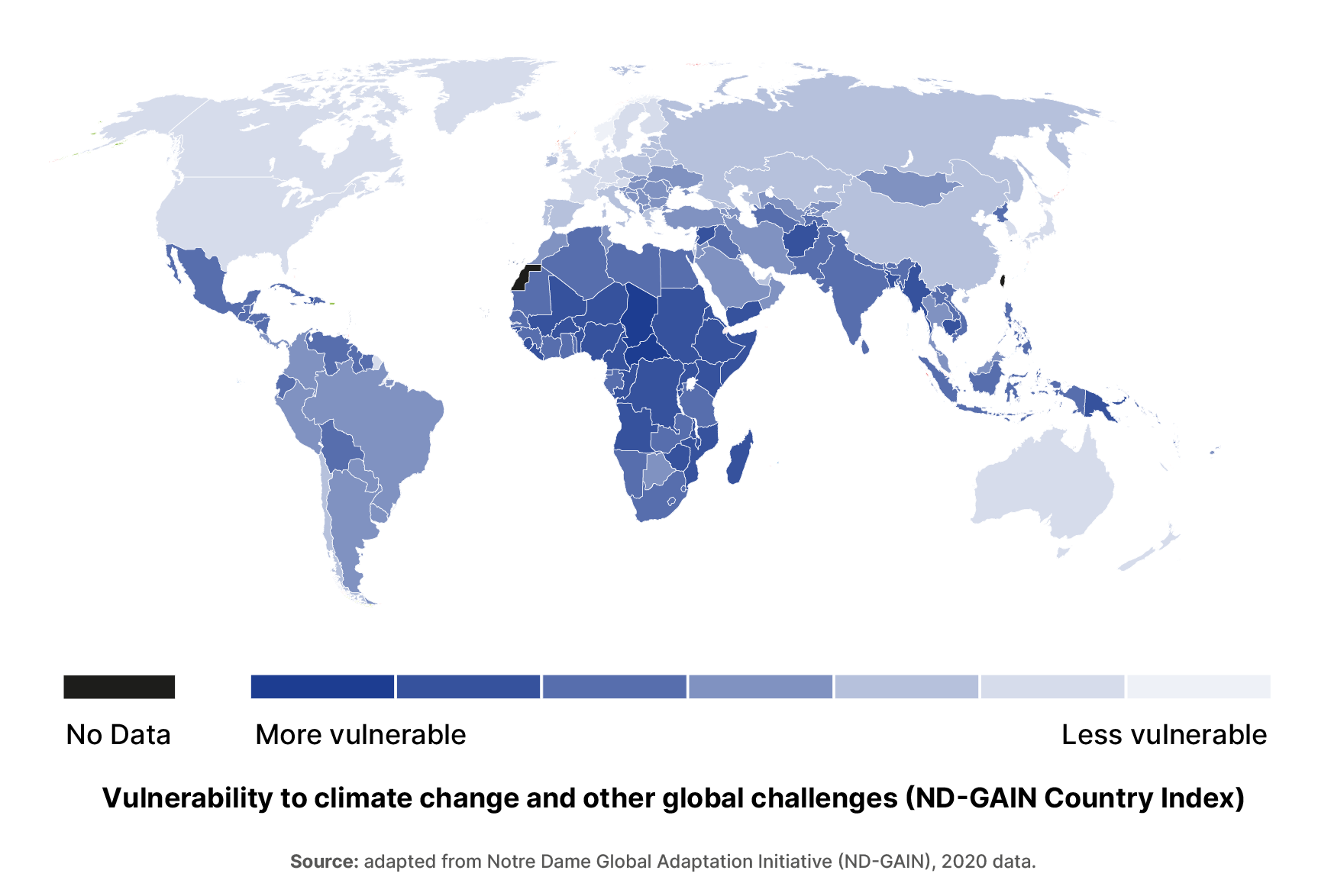
In this case, the What does mapping fossil fuel use and climate vulnerability look like? map explores the relationship between fossil fuel use by country and countries that are vulnerable to the impact of climate change.
Key term – Climate Vulnerability: ND-GAIN defines climate vulnerability as a measure of a country’s exposure, sensitivity and ability to adapt to the negative impact of climate change. It measures the overall vulnerability by considering vulnerability in six life-supporting sectors – food, water, health, ecosystem service, human habitat and infrastructure.
Explore the data used in these maps:
Suggested learning tasks
A number of learning tasks are suggested with ideas for integration as part of English, Art, Geography, Mathematics, Home Economics:
- Explore the visuals presented by scrolling between the two maps and the information they present. What do you think of the two stories that the data presents?
- Why are there different colours on the map?
- Look at the data sources and find something interesting. Draw a graph, table or pie chart of what you’ve found and prepare 1 sentence on why this is interesting to you.
- What are the differences between the maps? Prepare a short response to the two maps and what it tells us about geography and who is responsible.
- In small groups prepare a short visual presentation (using websites, statistics, images etc.) on the topic of inequality – what does inequality mean? How might it impact on people and places in this slider map in terms of accessing healthy nutritious food?
Explore the next two maps in the series on key drivers of global hunger:
For more: